Overview
Over the course of two months, I researched, designed, and polished a case study centered on creating an interactive museum exhibit for an artist of my choice. I chose Kiki Kogelnik because of her bold pop art style and strong feminist themes, which shaped both the concept and visual direction of the project. Throughout the process, I documented my design decisions from early ideas to final mockups. I conducted extensive user research, creating personas and proto-personas to keep the experience grounded in real visitor needs. To better understand accessibility and inclusive language, I reached out to MoPOP museum as a reference. This work is speculative.
Timeline
2 Months, 2025
Role
UX/UI Designer, Researcher, Graphic Designer
Tools
Figma, Adobe InDesign, Adobe Illustrator, Adobe Photoshop
Research, Persona Creation

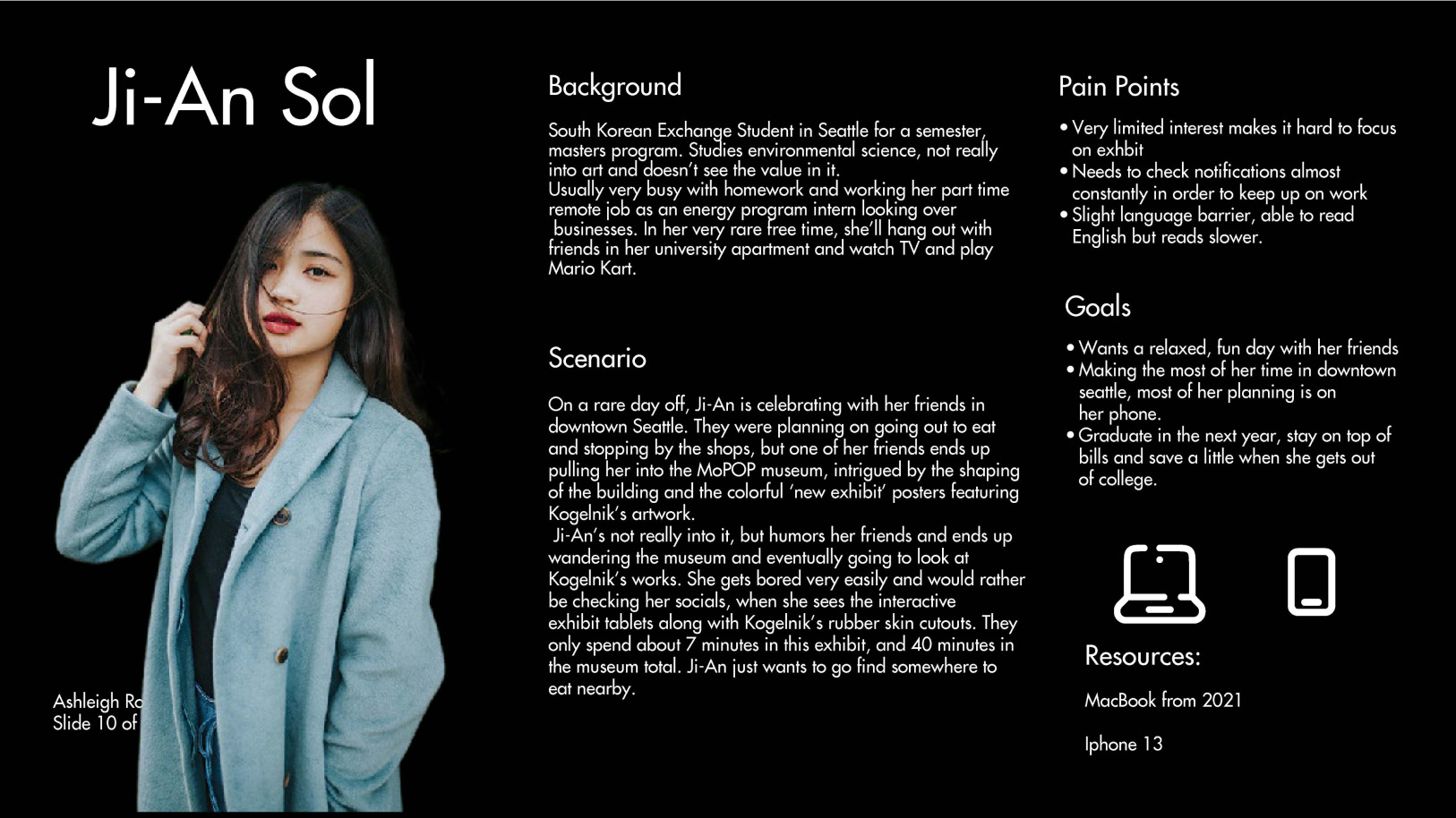
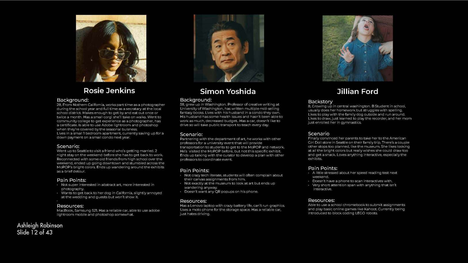
User Research
I conducted persona research using insights from three people with very different backgrounds: a 64-year-old from Idaho, a professor in Alabama, and a medical student in Washington. Each perspective highlighted different needs, from accessibility and ease of use to depth of information and efficiency. Comparing their goals and behaviors helped me find both shared patterns and key differences, which informed more realistic, well-rounded personas and ensured the design worked for a diverse range of users rather than just one audience.
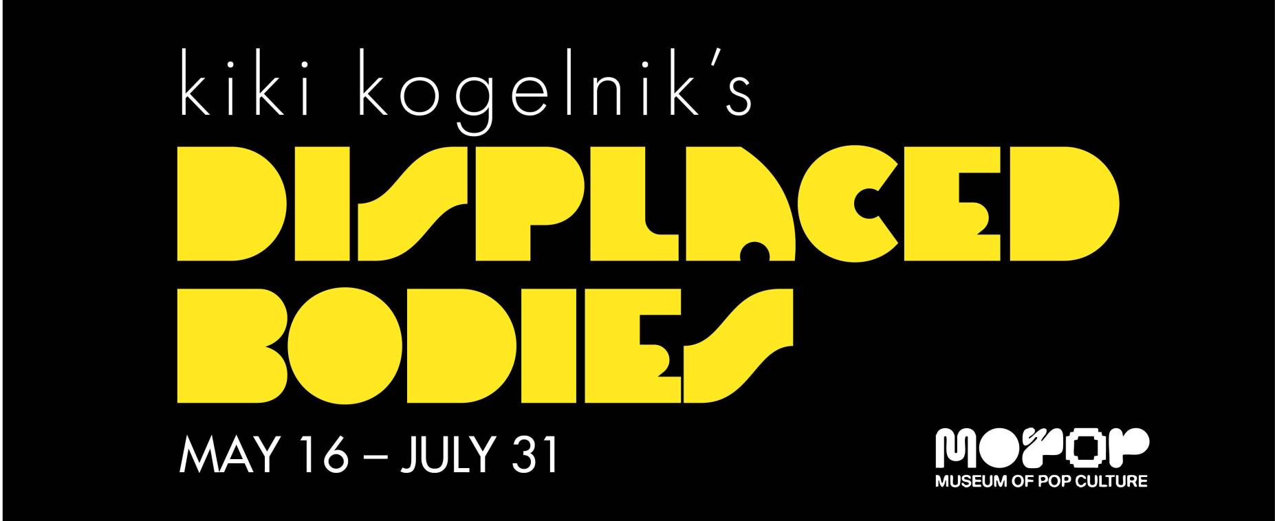
Branding
I needed my branding style to not only match the personality of Kogelnik, but the museum and culture in Seattle as well. Using bold, funky yellow action attention colors as well as a slick Futura font made app flows all the more accessible and eye catching.
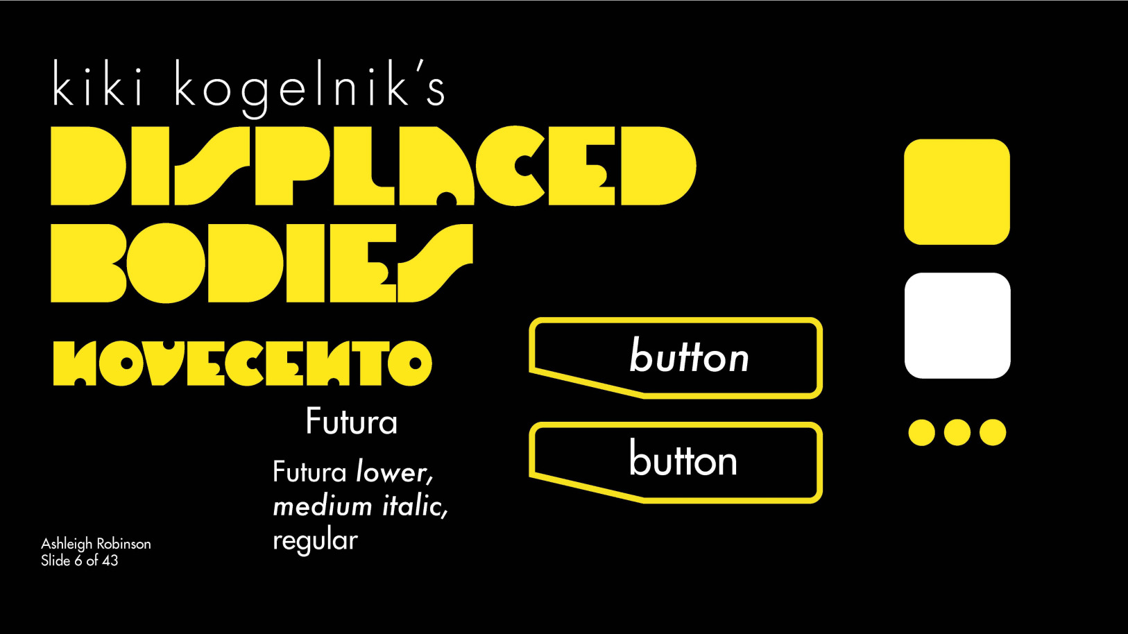
UI
I built out a tablet friendly UI in dark mode, as it allowed my action attention color to really pop.

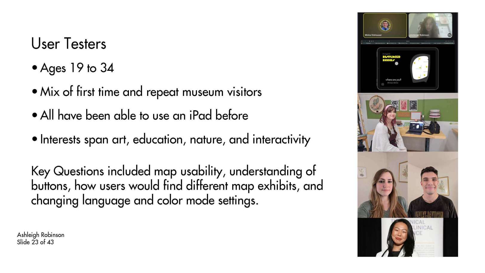
User Testing 1
In my first round of user testing, I interviewed testers from across the United States between the ages of 21 and 34. They provided helpful feedback including finding bugs in my prototype, spacing decisions, as well as general intuitive flow that had been blocked in the initial prototype.
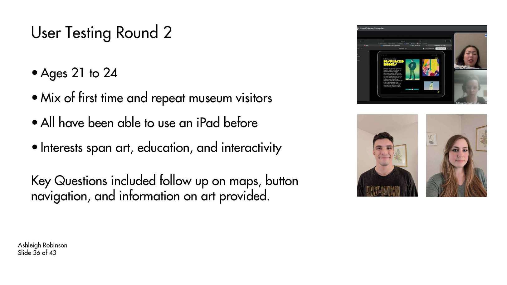
User Testing 2
In my second round of user testing, I interviewed previous testers from across the United States after doing some brief fixes to get feedback on anything that could still be improved. They provided feedback on general user flow items, such as an unneccesary double click. These were fixed in the final version shown on the User Flow Sheet.
Key Takeaways
I had previous experience doing user testing from other projects, but none as involved as this one was. It was also one of my first times using Figma since transferring from Adobe XD. This project really showed me how valuable user testing is when it comes to shaping a strong design. Seeing how people actually interacted with the experience helped me catch issues early (like bugs and weird errors) and make more user centric descisions.Learning new software during this project pushed me to become more comfortable adapting to new tools and workflows. On top of that, I gained a much better understanding of museum curation thanks to a special guest lecturer and some in house representatives of museum design.